With billions of smartphone users worldwide, ensuring your mobile app works flawlessly on every device is critical. That’s where mobile automation testing tools come in. These tools help QA teams streamline the testing process, reduce manual work, and deliver high-quality apps faster.
In this guide, you’ll discover the top mobile automation testing tools in 2025, how to choose the right one, and what makes each unique. Whether you're a developer, QA engineer, or team lead, this resource will help you make informed decisions and level up your mobile testing strategy.

Key Takeaways
- Make automation the foundation of mobile testing
Automated testing is essential for ensuring quality at scale. It reduces release cycles, improves app reliability, and lowers the long-term cost of QA. - Choose tools and strategies that align with your team
Match testing tools to your platform needs, technical expertise, and CI/CD setup. Write maintainable test scripts, use realistic test data, and plan for device fragmentation. - Test smarter, not harder
Prioritize test coverage based on real device usage, mix emulators with real devices, and continuously track key performance indicators (KPIs) such as test coverage, execution time, and bug rates. - Anticipate change—and build for it
Mobile environments shift quickly. Regularly update your automation tools, adapt to new operating system (OS) versions, and stay ahead with trends like AI-driven testing and visual validation.
What is Mobile Automation Testing?
Mobile automation testing uses tools and scripts to test the functionality of mobile apps automatically. Think of it as having a tireless robot meticulously checking every nook and cranny of your app, ensuring it works flawlessly. This automated approach helps identify bugs, improve app quality, and get your product to market faster. It's a critical process for any development team aiming to deliver a seamless user experience.
Definition and Purpose
At its core, mobile automation testing streamlines the testing process, making it more efficient and reliable. Instead of manually testing every feature on different devices and operating systems, automated tests handle the heavy lifting. This frees up your team to focus on more complex tasks, like developing new features or refining existing ones. The ultimate goal is to release a polished, high-performing app that meets user expectations and stands out in a competitive market. Teams can learn more about mobile application testing frameworks to understand how automated testing fits into the development lifecycle.
What Are Mobile Automation Testing Tools?
Mobile automation testing tools are software frameworks or services that help QA teams automate test cases on mobile devices, such as Android and iOS. They simulate user interactions, verify app behavior, and reduce manual effort. Also referred to as mobile testing frameworks or mobile test automation solutions, they are essential for efficient, repeatable, and scalable app testing.
Why You Need Mobile Testing Tools for Automation
Modern mobile applications are expected to work seamlessly across a wide array of devices and platforms. Mobile testing tools are essential in meeting these expectations efficiently and effectively. Here's how they make a difference:
-
Faster Test Execution and Continuous Testing: With seamless integration into CI/CD pipelines, automated mobile testing tools enable rapid feedback during development. Tests can be triggered automatically with every code change, ensuring that regressions are caught early and deployments remain stable.
-
Greater Coverage Across Devices and Operating Systems: The mobile ecosystem is fragmented, with different manufacturers, OS versions, screen sizes, and hardware configurations. Automation allows parallel testing on real devices and emulators, providing broader test coverage than manual testing ever could.
-
Higher Accuracy and Fewer Human Errors: Manual testing is prone to oversight, especially when repeated frequently. Automation delivers consistent and precise results, reducing false positives and the risk of missing critical bugs.
-
24/7 Testing Capabilities with Quick Feedback Loops: Automated test suites can run continuously, including during off-hours. This ensures the faster identification of issues and provides developers with actionable feedback the next day, keeping development cycles short and productive.
While setup may require an initial investment in time, training, or infrastructure, the long-term gains are significant. Automated mobile app testing scales with your project, reduces manual burden, accelerates releases, and ultimately enhances the quality and reliability of your product.
Criteria for Choosing the Right Mobile Automation Tool
.webp)
Before selecting a tool, consider these critical factors:
-
Platform Support
Ensure the tool supports the platforms you’re developing for, whether it’s Android, iOS, or both. Check if it works on real devices, emulators, or cloud-based environments. Cross-platform compatibility can streamline your workflow by reducing the need for duplicate test cases.
-
Ease of Use
Determine if the tool aligns with your team’s skill set. Some tools require programming knowledge (e.g., Appium or Espresso), while others offer codeless interfaces that allow non-developers to contribute. The steeper the learning curve, the longer the onboarding process will take.
-
Integration
Seamless integration with CI/CD pipelines, source control systems, bug trackers, and test case management tools is critical. Select a tool that integrates well with your existing DevOps ecosystem and supports automated test execution.
-
Community and Support
A large and active user community means more tutorials, forums, plugins, and solutions to common problems. Vendor support, documentation quality, and frequency of updates can significantly impact your ability to troubleshoot and evolve your test strategy.
-
Cost
Evaluate both upfront and long-term costs. Open-source tools may have no licensing fees but could incur maintenance or scaling costs. Commercial tools often provide additional features, support, or infrastructure that can reduce time to value, but at a higher price point.
These criteria shape your success with the chosen mobile testing framework and should align with your project goals, your team's expertise, and the maturity of your infrastructure.
Comparison Table of Top Mobile Automation Tools
| Tool/Framework | Platforms Supported | Type | Scripting Required | Notable Features |
|---|---|---|---|---|
| MuukTest | Android, iOS | Commercial | Optional | Cloud + flexible testing |
| Appium | Android, iOS | Open-source | Yes | Cross-platform, plugin support |
| Espresso | Android | Open-source | Yes | Fast native UI testing |
| XCUITest | iOS | Open-source | Yes | Integrated with Xcode |
| Selenium/Selendroid | Android | Open-source | Yes | WebDriver for older Android |
| Robotium | Android | Open-source | Yes | Legacy Android support |
| Calabash | Android, iOS | Open-source | No | Natural language scripting |
| Perfecto | Android, iOS | Commercial | Varies | Cloud-based device lab |
| Kobiton | Android, iOS | Commercial | Optional | Real devices + scriptless |
| TestComplete | Android, iOS | Commercial | No | Scriptless and coded tests |
Top Mobile Automation Testing Tools in 2025
Below is a list of the most popular mobile test automation tools, along with their key features, pros, cons, and ideal use cases.
1. MuukTest
(Disclosure: This is our tool)
MuukTest is an AI-powered mobile and web test automation platform built to simplify testing, whether you’re a seasoned engineer or just starting. It supports both code-based and codeless automation, letting you test across real devices without the typical setup headaches.
- Key Features:
-
Low-Code/Codeless test creation: Create and run powerful tests without writing a single line of code, perfect for product managers, QA analysts, and developers alike.
-
Fast onboarding & expert guidance: Get your tests running in hours, not weeks, with help from our QA experts.
-
Built to scale: Whether you're testing a single feature or an entire release, MuukTest keeps up automating hundreds to thousands of tests with ease.
-
Cross-platform support: Web and mobile? Handled. No need to juggle multiple tools.
-
Ideal for:
-
- Teams that want to move fast, automate confidently, and collaborate across tech skill levels. Learn more about how MuukTest can benefit your team.
Considerations:
-
-
Best suited for startups and growing businesses rather than individual or personal use.
-
2. Appium
Appium is a favorite among developers due to its open-source and cross-platform nature. It supports automation of native, hybrid, and mobile web applications across Android and iOS using the WebDriver protocol. Appium is language-agnostic, supporting Java, Python, JavaScript, and more, allowing teams to write tests in the language they’re most comfortable with.
-
Key Features:
-
Cross-platform (Android/iOS)
-
Open-source and free
-
Large community and plugin support
-
-
Pros: Flexible and widely adopted
-
Cons: Setup and debugging can be complex
3. Espresso (Android)
Developed by Google, Espresso is designed for functional UI testing of Android apps. It allows developers to write concise, reliable Android UI tests that run within the app's process, providing fast execution. Its synchronization capabilities with the UI thread make tests stable and less flaky.
-
Key Features:
-
Built-in with Android SDK
-
Fast and reliable UI tests
-
Developer-friendly
-
-
Pros: Ideal for native Android apps
-
Cons: Android-only
4. XCUITest (iOS)
Developed by Apple, XCUITest is the preferred framework for testing the UI of iOS apps. It’s fully integrated with Xcode, enabling developers to create UI tests using Swift or Objective-C. The tests run on simulators and real devices, supporting advanced interactions such as gesture recognition and scrolling.
-
Key Features:
-
Uses Swift/Objective-C
-
Seamless Xcode integration
-
Optimized for iOS
-
-
Pros: Stable and high performance
-
Cons: Limited to iOS
5. Selenium + Selendroid
Selenium is a widely used open-source tool for automating web applications, and Selendroid extends its capabilities to older Android platforms (pre-Android 4.4). Selendroid enables automation of native and hybrid Android apps, making it a useful option for teams supporting legacy devices. It integrates seamlessly with the Selenium WebDriver API, so teams already using Selenium for web automation can easily adapt their scripts for mobile testing. Although it's no longer under active development, Selendroid remains relevant for backward compatibility and test reuse.
-
Key Features:
-
Leverages WebDriver API
-
Good for hybrid apps
-
Open-source
-
-
Pros: Familiar to Selenium users
-
Cons: Outdated for modern Android
6. Robotium
Selenium is a widely used open-source tool for automating web applications, and Selendroid extends its capabilities to older Android platforms, specifically those running pre-Android 4.4. Selendroid enables automation of native and hybrid Android apps, making it a valuable option for teams supporting legacy devices. It integrates seamlessly with the Selenium WebDriver API, so teams already using Selenium for web automation can easily adapt their scripts for mobile testing. Although it's no longer under active development, Selendroid remains relevant for backward compatibility and test reuse.
-
Key Features:
-
Open-source
-
Simple to use
-
Black-box testing
-
-
Pros: Fast setup
-
Cons: Limited to older Android versions
7. Calabash
Calabash was developed to make mobile testing accessible to non-programmers. It enables test creation in plain English using Cucumber’s Gherkin syntax, making it ideal for behavior-driven development (BDD) workflows. It supports both Android and iOS, allowing testers to define interactions such as touch gestures, screen navigation, and assertions in a human-readable format. While Calabash was discontinued, it paved the way for modern no-code testing solutions and remains notable for teams transitioning from manual testing to automation.
-
Key Features:
-
Scriptless via Gherkin syntax
-
Works on Android/iOS
-
Beginner-friendly
-
-
Pros: Accessible to non-coders
-
Cons: Not actively maintained
8. Perfecto Mobile
An enterprise-grade testing platform offering cloud-based access to real mobile devices across multiple locations. It supports both manual and automated testing with tools like Appium and Selenium. It includes robust analytics, debugging, and CI/CD integration, making it ideal for large-scale, high-compliance mobile testing.
-
Key Features:
-
Real device access
-
CI/CD and analytics integration
-
Automation support (Appium/Selenium)
-
-
Pros: Great for scalability and analytics
-
Cons: Paid service
9. Kobiton
Kobiton is a mobile testing platform that offers real-device testing in the cloud, supporting both manual and automated test execution. It supports Appium, Selenium, and integration with custom scripts. With features like session recording and performance metrics, it enables teams to streamline mobile testing and enhance quality assurance.
-
Key Features:
-
Real device cloud
-
Integrates with Appium/Selenium
-
Record-and-playback features
-
-
Pros: Affordable and user-friendly
-
Cons: Smaller community
10. TestComplete (SmartBear)
TestComplete by SmartBear is a commercial UI automation tool that supports testing for mobile, web, and desktop apps. It offers both scriptless and scripted test creation, supports keyword-driven testing, and features AI-powered object recognition. It’s ideal for teams looking for low-code test automation that’s quick to deploy.
-
Key Features:
-
Scriptless or coded tests
-
AI-based object recognition
-
Wide scripting language support
-
-
Pros: Easy for beginners
-
Cons: Paid license
Best Practices for Effective Mobile Test Automation
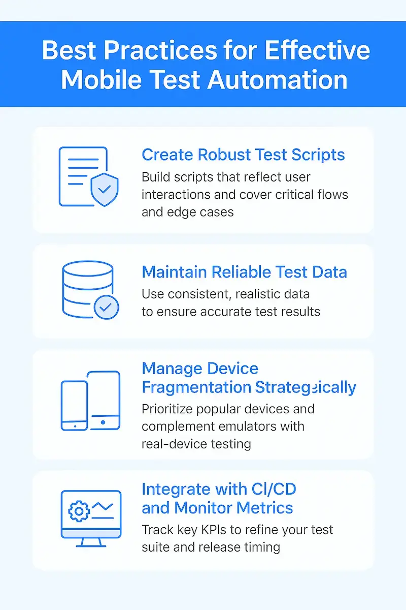
Implementing mobile automation successfully requires more than just choosing the right tool. Here are key practices to ensure your automation strategy delivers tangible results:
Create Robust Test Scripts
Once your tool is selected, focus on building test scripts that reflect real user interactions. Cover critical user flows, edge cases, and performance thresholds. Well-structured test cases are not only more reliable but also easier to maintain as your app evolves. Use existing analytics to identify high-traffic areas and prioritize those scenarios.
Maintain Reliable Test Data
Consistent, realistic test data ensures that your test results accurately reflect real-world use. Organize test data using structured sources, such as spreadsheets or databases, and keep the inputs relevant to your current app logic. Incorporate boundary values, invalid data, and scenario-specific combinations to uncover bugs that might otherwise go unnoticed.
Manage Device Fragmentation Strategically
Testing on all devices is impossible, but you can be smart about coverage. Use user analytics to identify the most popular devices in your target markets and prioritize those. Complement emulator use with real-device testing to account for variations in hardware, network, and sensors.
Integrate with CI/CD and Monitor Metrics
While CI/CD integration is a given, what often gets overlooked is post-integration tracking. Monitor key KPIs such as test execution time, pass/fail rates, and code coverage. Use these metrics to refine both your test suite and your release timing.
Common Mobile Automation Testing Challenges and How to Solve Them
Even the best strategies run into roadblocks. Here’s how to proactively address common challenges in mobile test automation:
Dynamic UI Elements
Mobile apps often include UI elements that change based on state or user interaction. To handle this reliably, use unique selectors or accessibility IDs. Combine these with bright wait conditions to avoid flaky tests that break with slight UI delays or animations.
Test Environment Management
Setting up and maintaining stable test environments, especially device labs, can be a resource-intensive process. Cloud-based platforms like Kobiton and Perfecto simplify this by offering instant access to real devices. These environments can be configured to mimic production, ensuring reliable results without hardware overhead.
OS and Device Update Cycles
Mobile platforms evolve rapidly. To stay ahead, test frequently on beta OS versions and keep your automation tools and scripts up to date with the latest SDKs. Use tools with backward compatibility features and plan regular maintenance windows to keep your test suite up to date.
Bridging Skill Gaps
Automation success hinges on skilled testers. If your team is new to automation, prioritize platforms with low-code or codeless options, such as MuukTest or TestComplete. Invest in training and mentorship, and leverage vendor support or documentation to upskill more quickly.
Measuring Success and Preparing for the Future
A great automation strategy doesn’t stop at execution; it needs to be measured and improved continuously.
- Track Test Performance Metrics: Start with basics like test pass rate, execution duration, and the number of bugs found before and after release. Then dig into more strategic KPIs, such as test coverage percentage and regression stability. These metrics offer a clear picture of automation ROI.
- Understand ROI in Business Terms: Beyond test metrics, measure how automation impacts the business. Are releases faster? Are defect rates dropping? Is customer satisfaction improving post-release? Connecting testing to business outcomes will help justify investment and guide future scaling.
- Stay Ahead with Emerging Tools: Mobile testing is evolving rapidly. Keep an eye on AI-enhanced testing, visual validation tools, and predictive defect detection. New platforms are making mobile test automation more innovative and more accessible, and embracing these early can offer a competitive edge.

Conclusion
Every team’s mobile testing journey is different, but the goal is always the same: faster, better, more reliable apps. With the right tools, a solid strategy, and an eye on real-world impact, your team can master automation and release with confidence.
Whether you’re building your first automation suite or scaling an existing process, focus on practices that improve test coverage, maintainability, and business impact. From choosing a platform that fits your team’s skill set to monitoring KPIs that reflect real-world outcomes, success lies in continuous improvement.
As mobile ecosystems evolve, so should your testing approach. The teams that invest in scalable automation today will be the ones leading in quality, velocity, and customer satisfaction tomorrow.
Need help accelerating your mobile automation journey?
MuukTest combines expert support with scalable automation, helping your team achieve complete mobile test coverage fast.
Frequently Asked Questions
Why is mobile automation testing so crucial for my app?
In today's competitive app market, users expect a seamless experience, regardless of the device they're using. Mobile automation testing helps you deliver on that expectation by ensuring your app works flawlessly across a wide range of devices and operating systems. It also speeds up your development process, allowing you to release updates and new features more frequently, and ultimately saves you money by catching bugs early.
What are some of the top mobile automation testing tools available?
There are many great tools available, each with its strengths. Appium is a popular open-source choice known for its cross-platform compatibility. Espresso is a solid option for Android testing, while XCUITest is explicitly designed for iOS. MuukTest offers a unique approach, focusing on complete test coverage within 90 days. The best tool for you will depend on your specific needs and resources.
How do I choose the right mobile automation testing tool for my team?
Consider your team's technical skills, your budget, and your app's specific requirements. Think about which platforms you need to support (iOS, Android, or both), whether you need seamless integration with your CI/CD pipeline, and what level of reporting and analytics you require. Don't be afraid to try out a few different tools with free trials or demos before making a decision.
How do I choose between cloud-based vs. local mobile testing tools?
Cloud tools, such as Muuktest, offer scalability and access to real devices without requiring hardware management. Local tools, such as Appium and Espresso, offer control and cost-effectiveness.
How can I measure the success of my mobile automation testing efforts?
Tracking key metrics, such as test pass rate, coverage, and defect detection rate, is a good starting point. Analyzing your return on investment and overall performance using relevant key performance indicators (KPIs) will give you a deeper understanding of how your testing process contributes to your business goals. Staying up to date with emerging technologies and trends in mobile testing will also help you continually improve your testing strategy.